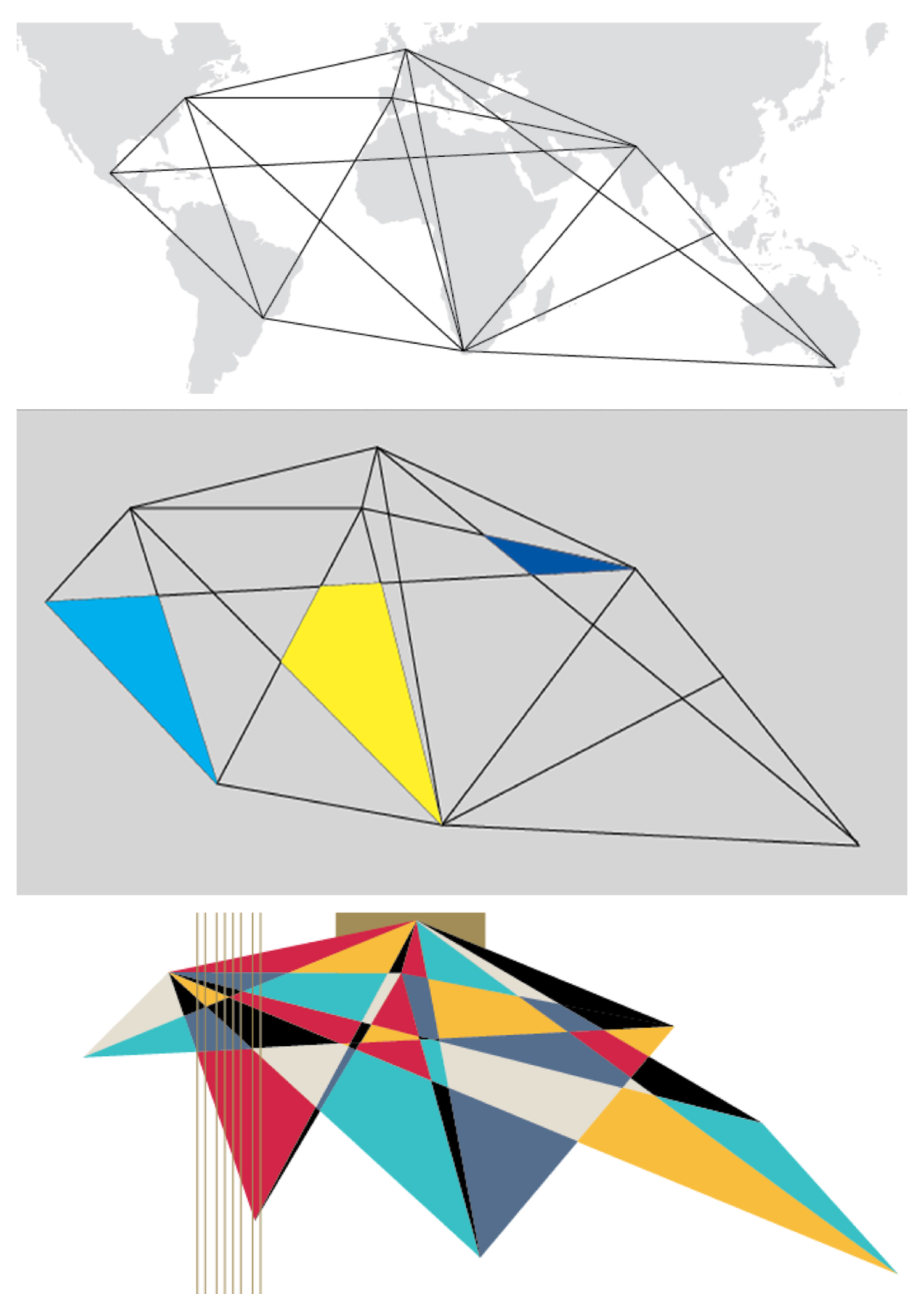
Our conceptual approach was to combine the location of all our branches to produce a unique geometrical shape. Once, that was developed we began to style this shape in a way that would appeal to a generic audience (both male and female of any age).
If there's one thing I've learned from many years of being a graphic designer, its that strategic and conceptual brainstorming (when thoroughly examined) will more than often lead to a unique design. Now, of course there may be certain styles and elements that may seem similar to something you've seen previously, but the overall presentation is what makes any and every design piece 'unique'.
The marketing communications team of Cambridge was given the opportunity (for the first time) to work together to produce its 2015 catalog for ESL. This team consisted of multiple designers, with varied levels of expertise as well as different cultural and personal perspectives. In anycase, our initial approach was to think conceptually into the design of–brainstorming visual possibilities, as well as digital, keeping in mind of what Cambridge is in its entirety. 2014 (at the time of design), was a year of transition as Cambridge launched several digital materials for its first time. We definitely wanted to reflect and maintain that ideal throughout the cover.
Again, being that this was our first time collaborating with a global marketing team, we also wanted to express our partnership in a more abstract way. After allwe exist solely due to the cooperation and collaborative efforts of hundreds of individuals on a global vector. So, in what ways could we express that ideal, without using the typical cliched' globe icon, or images of?
Once we finished our initial approaches and sketches, we decided to build structure based on all of Cambridge's branches on a map, connecting them to each other (as we are connected, ourselves). The lines presented represent the strength of our connection, as we decided to eliminate the literal depiction of a map. We then looked at several visual options to place within and/or around this newly developed shape, as we wanted to maintain some sort of humane element. Photographs did not work as strongly as the textural backgrounds and so we began to dabble with a play of color. In the end, our cover was produced, giving us a unique look that is not typical of educational publishing.


